FILM
Agency: Saatchi & Saatchi NY
Client: Downy
Product: Downy Free & Gentle
Role: Creative Direction, Art Direction
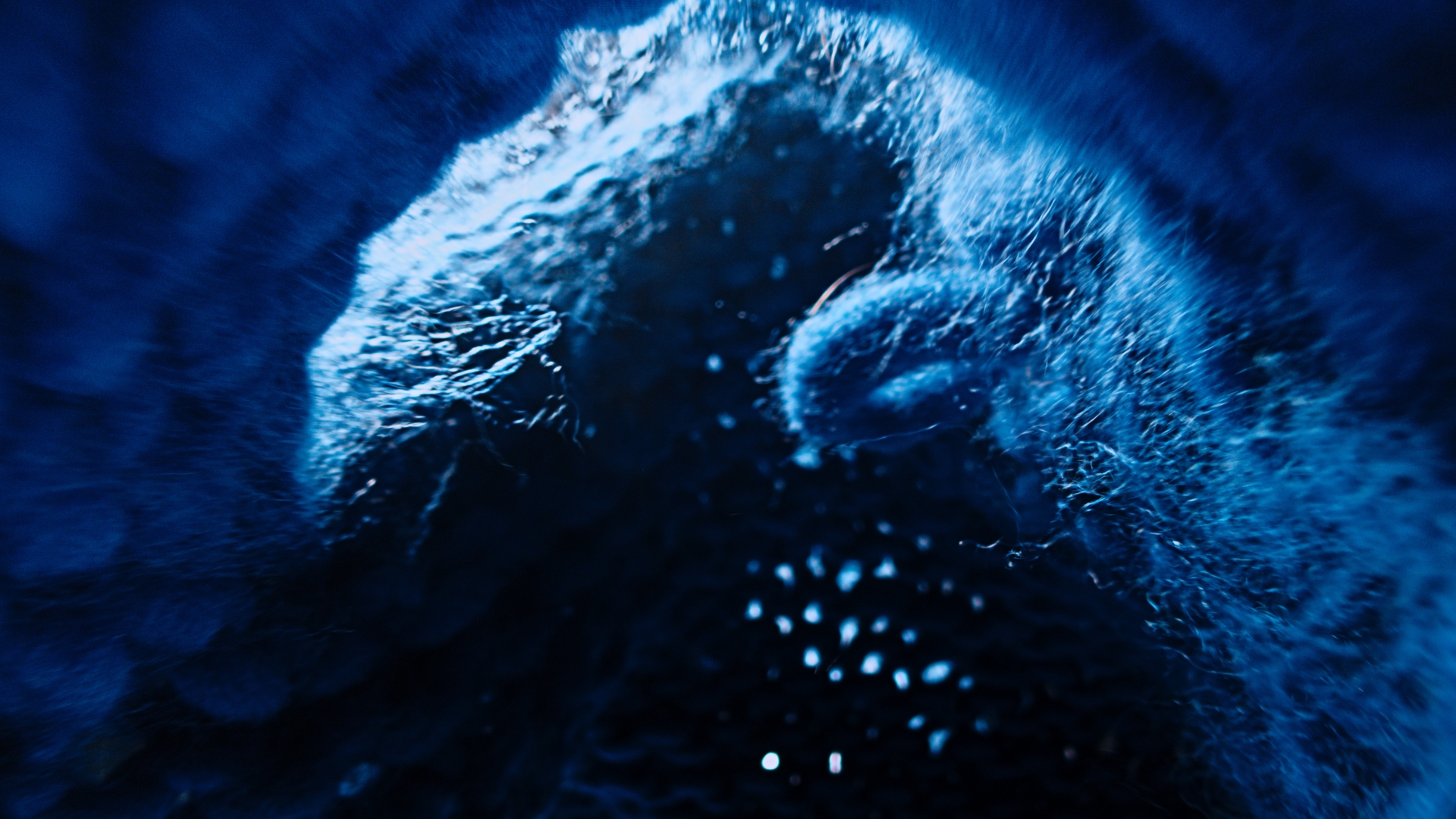
Fabric softener ads have always focused on how fabrics feel: soft towels, cozy sweaters, comfort.
But they ignore what those fabrics touch: your skin.
With over 70% of people experiencing sensitivity, we reframed the category from fabric care to skin care.
But they ignore what those fabrics touch: your skin.
With over 70% of people experiencing sensitivity, we reframed the category from fabric care to skin care.
We didn’t want to simulate this, we wanted to prove it.
Using microscopes, probe lenses, and custom rigs, we captured everyday fabrics at an extreme level of detail.
What looks soft to the eye revealed itself as rough and abrasive up close.
The result was a cinematic way to show why Downy Free & Gentle matters.

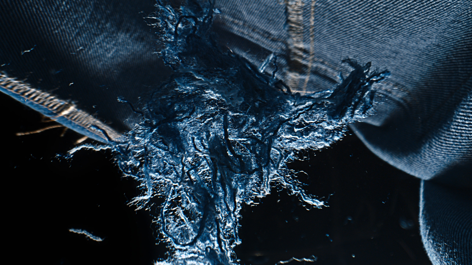
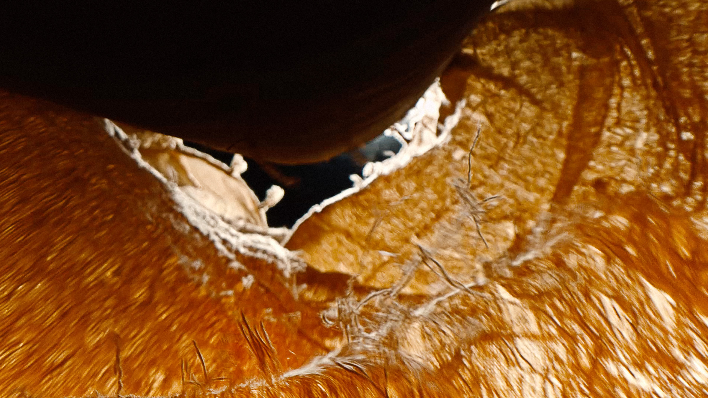


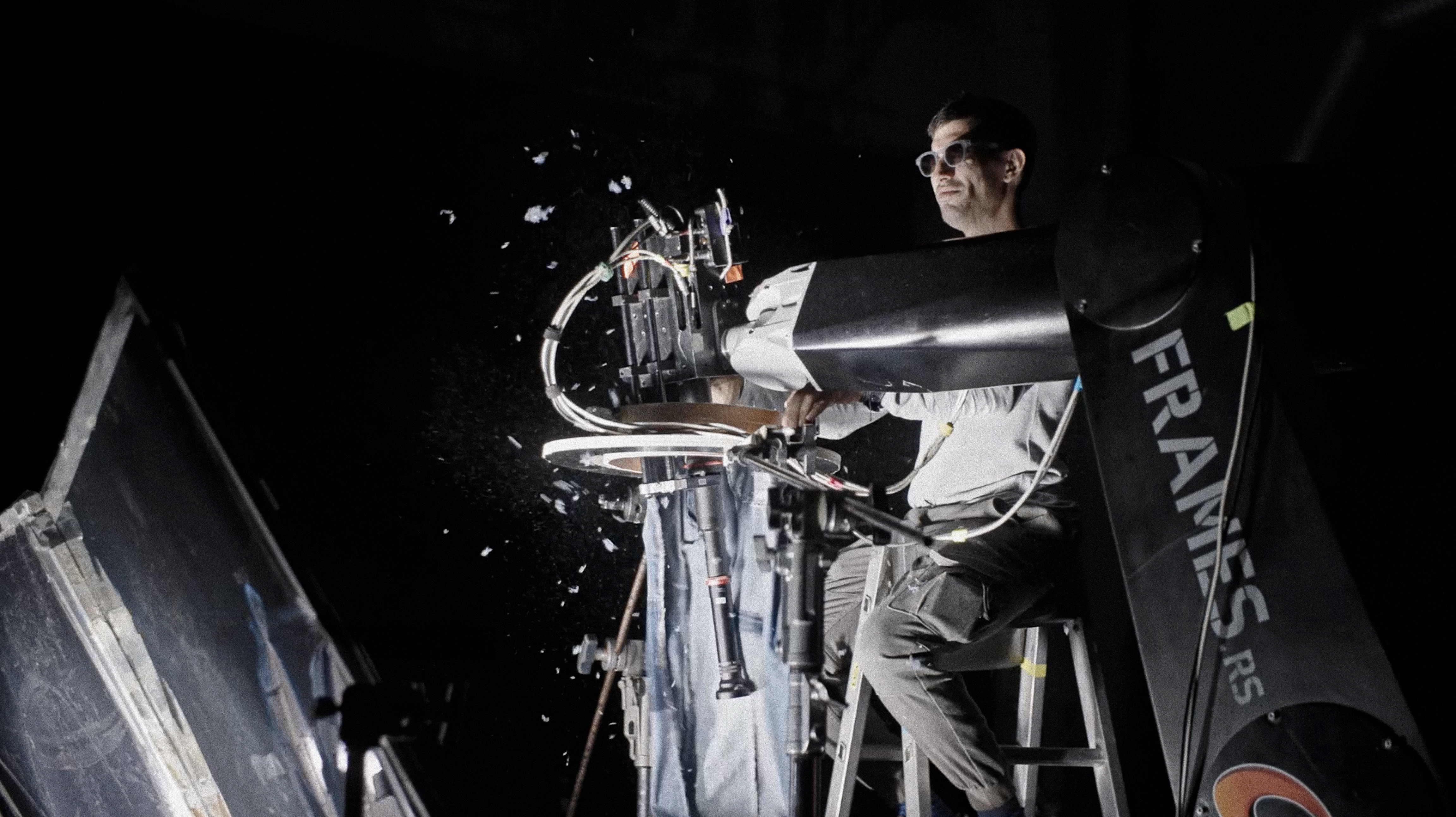


No CGI, no physical models, and three days of camera tests led to scenes that promise to leave the viewers feeling itchy.

EXPERIENTIAL | ACTIVATION
Agency: Publicis NY
Client: Citi
Product: Citi Wealth
Role: Art Direction
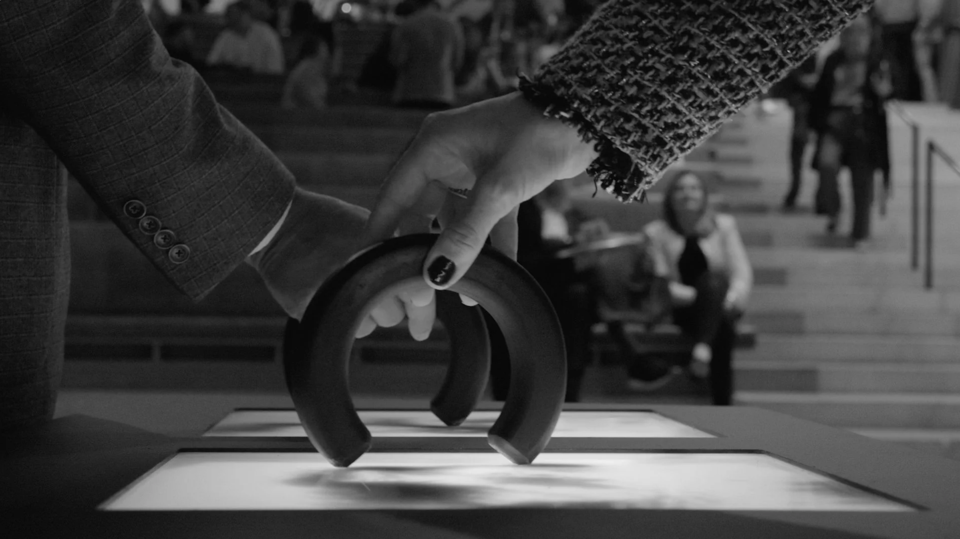
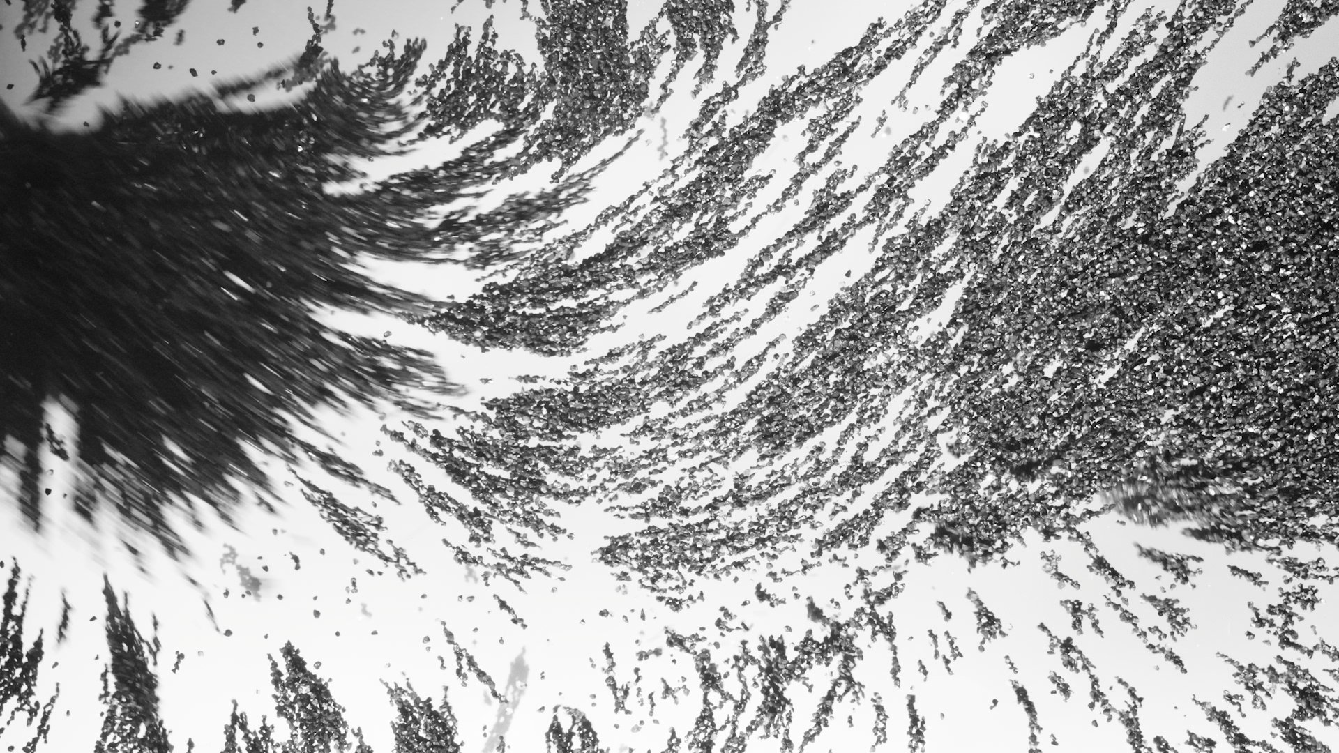
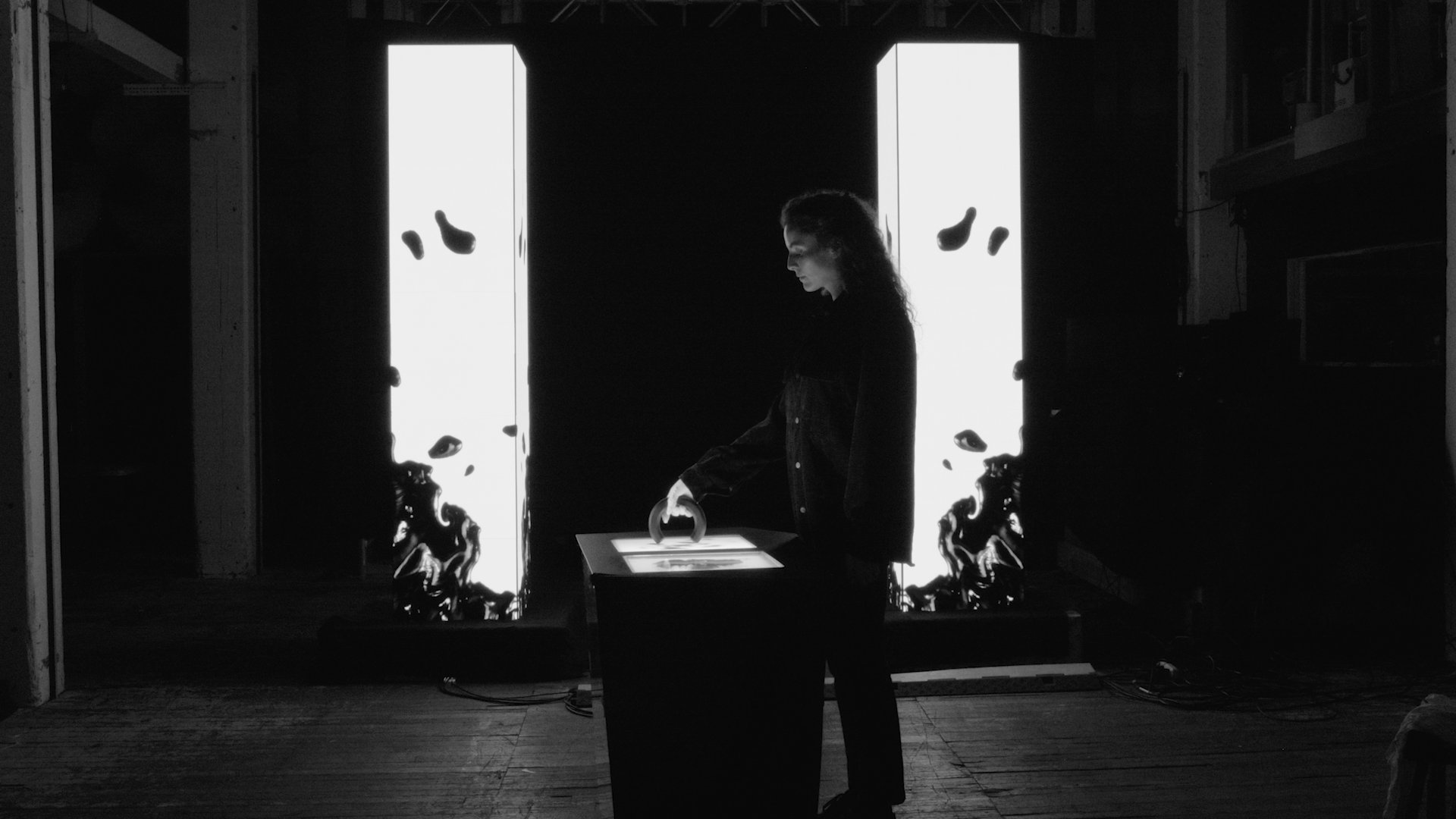
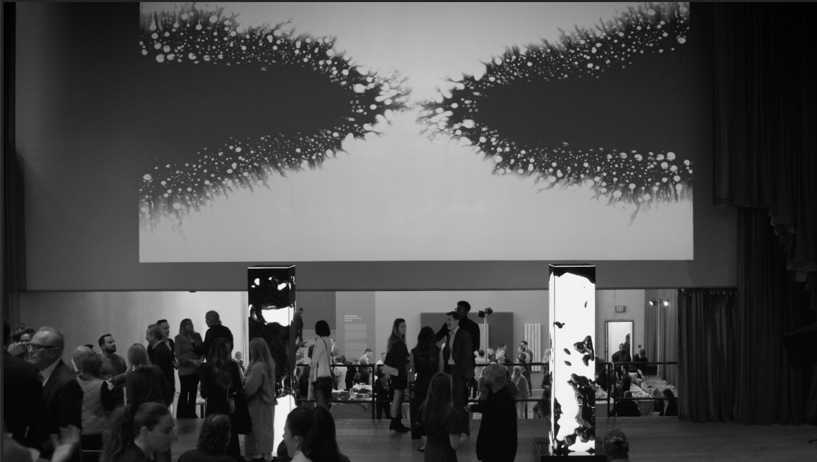
Citi’s perspective on wealth is that it’s shaped by collisions: different forces coming together to create something new.
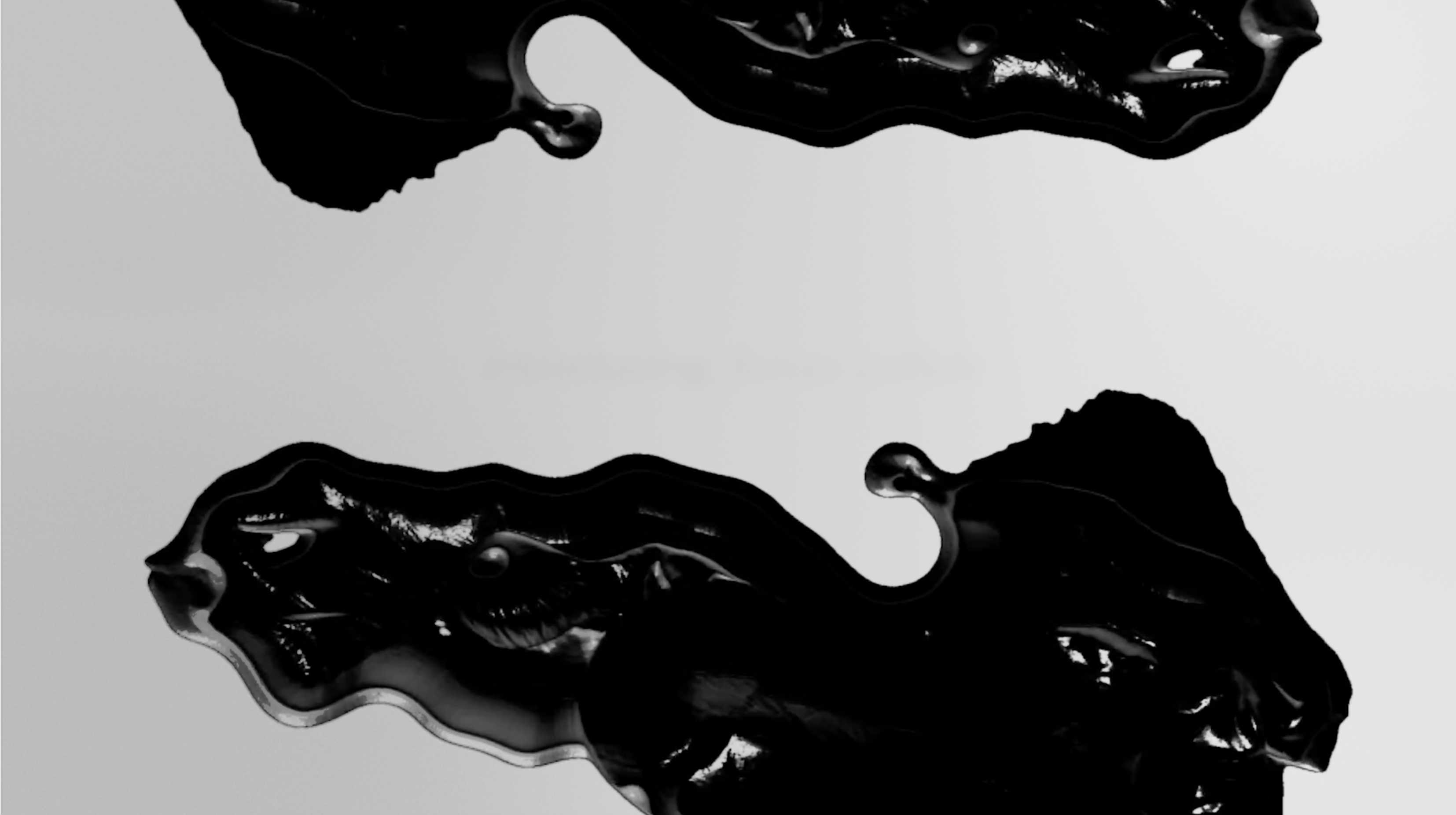
We translated that idea into an installation at the Pérez Art Museum during Miami Art Week.
Using magnetic fluid, visitors could shape and disrupt a living surface in real time, interacting with both the material and each other. Their movements were projected across the gallery, turning those interactions into a shared visual expression.
To create it, we experimented with magnetic fluids, materials, magnets, and custom setups, balancing control and unpredictability.
FILM | SOCIAL | MUSIC PRODUCTION
Agency: FCB San Francisco
Client: Clorox | Bleach
Role: Art Direction, Design,
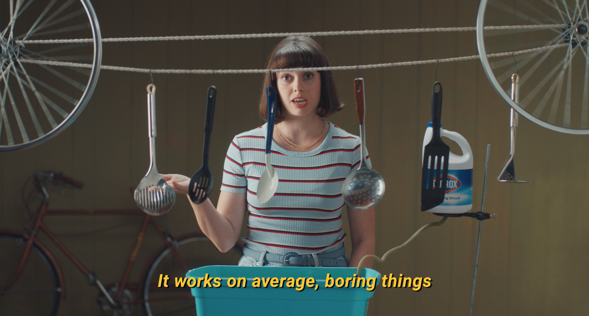
Before bleach saw a surge in demand in 2020, it was seen as the “nuclear option” of household cleaners: intimidating, outdated, and avoided by younger generations. They didn’t know when to use it, how to use it, or why they should. So we set out to change that.
Our goals were clear: find fresh, relevant ways for Millennials and Gen Z to use bleach in everyday life, and flip fear into curiosity.
We launched a music video that doubled as a “how-to”, wrapping educational content in karaoke-worthy lyrics to teach a new generation how to use our product.
Our goals were clear: find fresh, relevant ways for Millennials and Gen Z to use bleach in everyday life, and flip fear into curiosity.
We launched a music video that doubled as a “how-to”, wrapping educational content in karaoke-worthy lyrics to teach a new generation how to use our product.
RESULTS
RESULTS
Even with limited media support, the video took off and quickly grew to +10 million views and 4.7k+ likes on YouTube.
Our average view duration was 54 seconds! Almost everyone who saw this video decided to watch to the end.
*On Youtube, the average view duration for a 60 second ad is 7 seconds. Most advertisers are lucky to get someone more than two seconds past the ‘skip ad’ button. (Take that best digital practices!)


We also did some fun animations to support it
︎︎︎
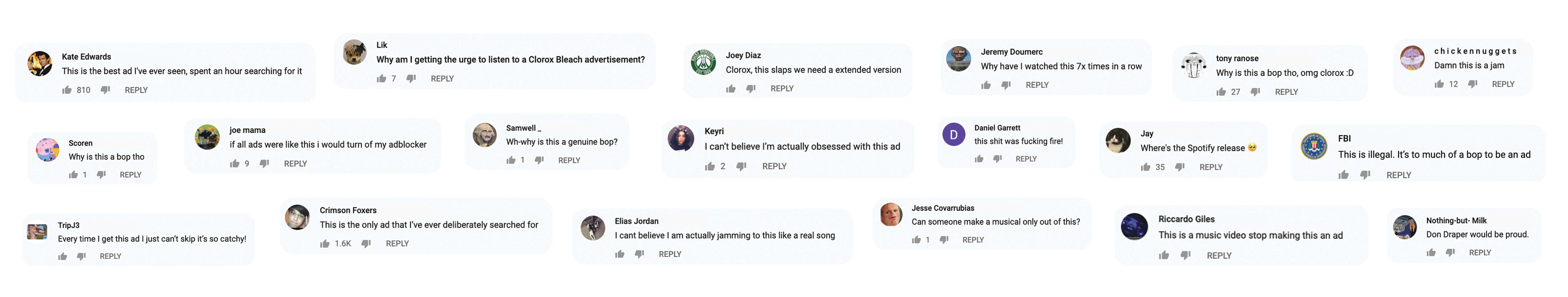
What people were saying
︎︎︎
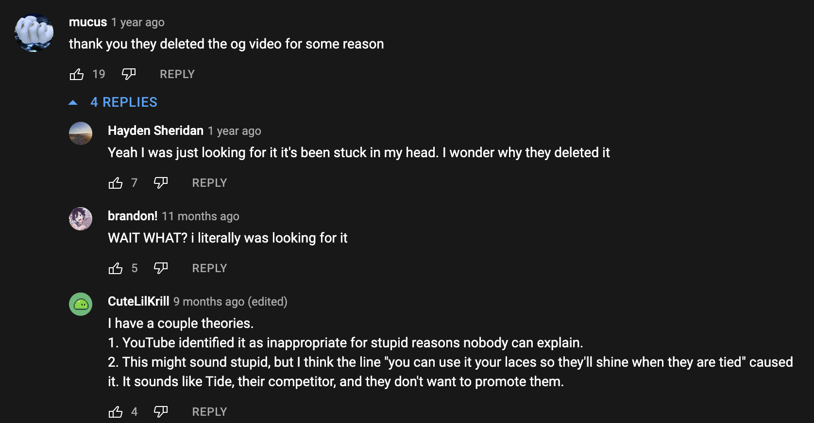
People liked it so much that someone actually went ahead and did
a 20 min version of it >>>
Yeah, Bleach does that...for 20 mins
Yeah, Bleach does that...for 20 mins


FILM | SOCIAL | EXPERIENTIAL
Agency: GALE
Client: Cotton
Partner: Lisa Says Gah!
Role: Creative Direction, Art Direction
Holiday dinners come with turkey, pie, and the same questions every year: relationship status, career plans, life updates.
Cotton is known for comfort, even in uncomfortable situations. So instead of avoiding the questions, we answered them first.
I developed the idea and led the art direction for a series of limited-edition cotton tees with pre-written responses to the holiday Q&A.
Five tees. Five answers. A more comfortable way to handle the holidays.


RESULTS
RESULTS
The idea earned its way into culture, with coverage in CNN, Yahoo, and Fashionista.
The campaign generated over 508M impressions, including nearly 500M in earned media.
With 479 placements and strong influencer engagement, the collection turned
a relatable holiday tension into a widely shared cultural moment.


FILM
Agency: GALE Partners
Client: Diageo
Product: 21Seeds Infused Tequila
Role: Creative Direction, Art Direction
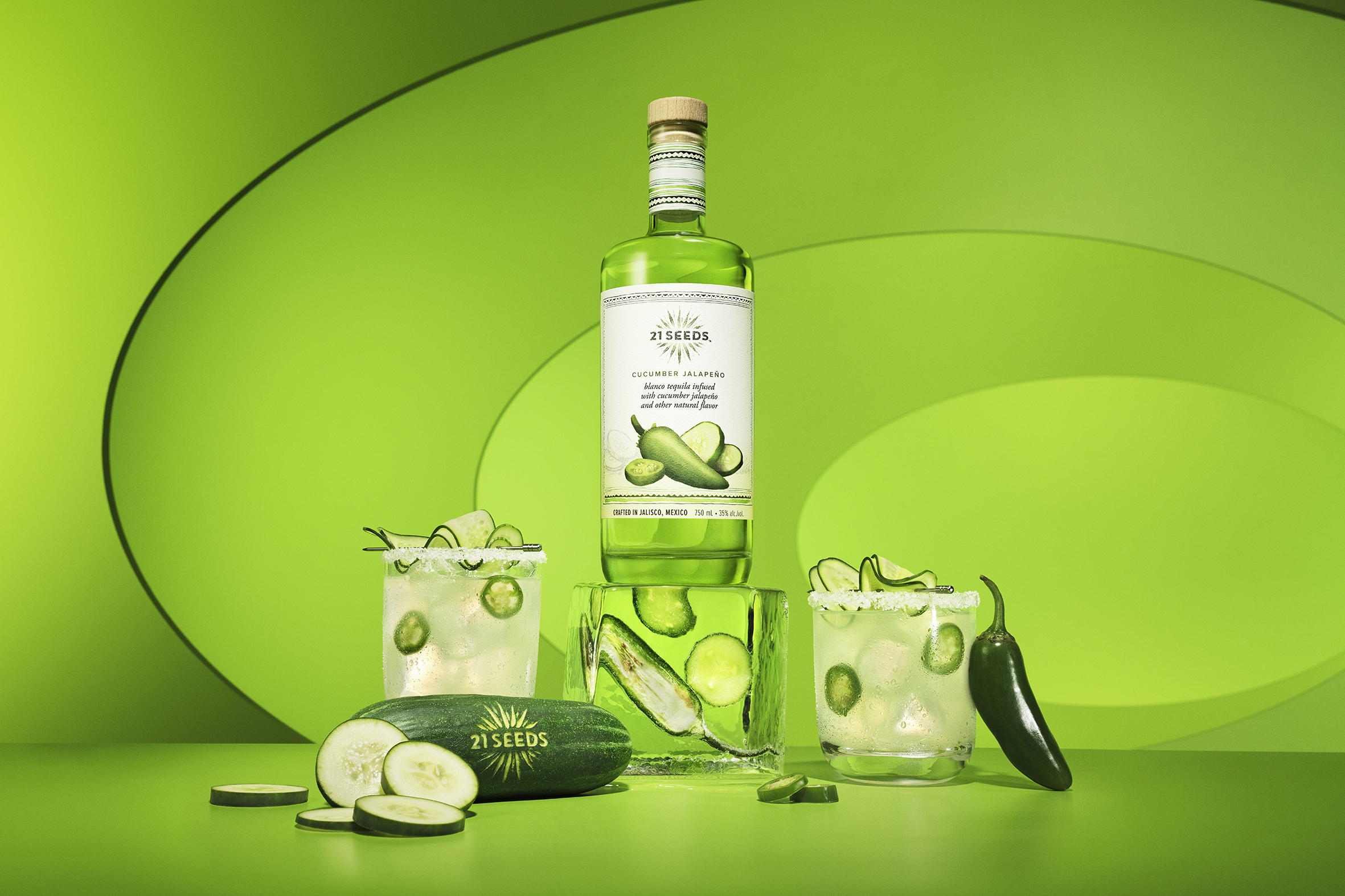
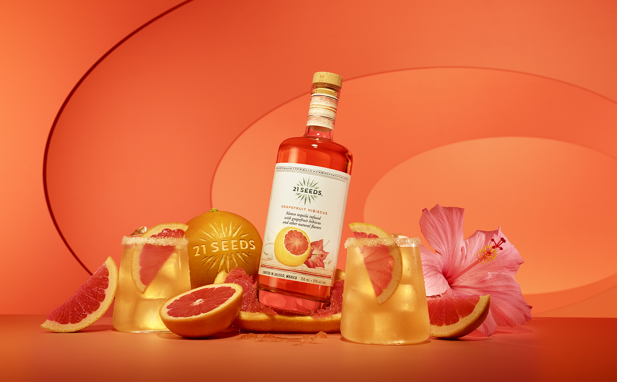
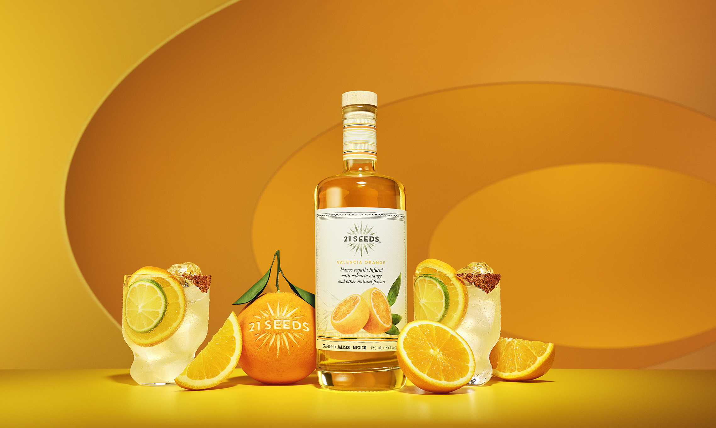
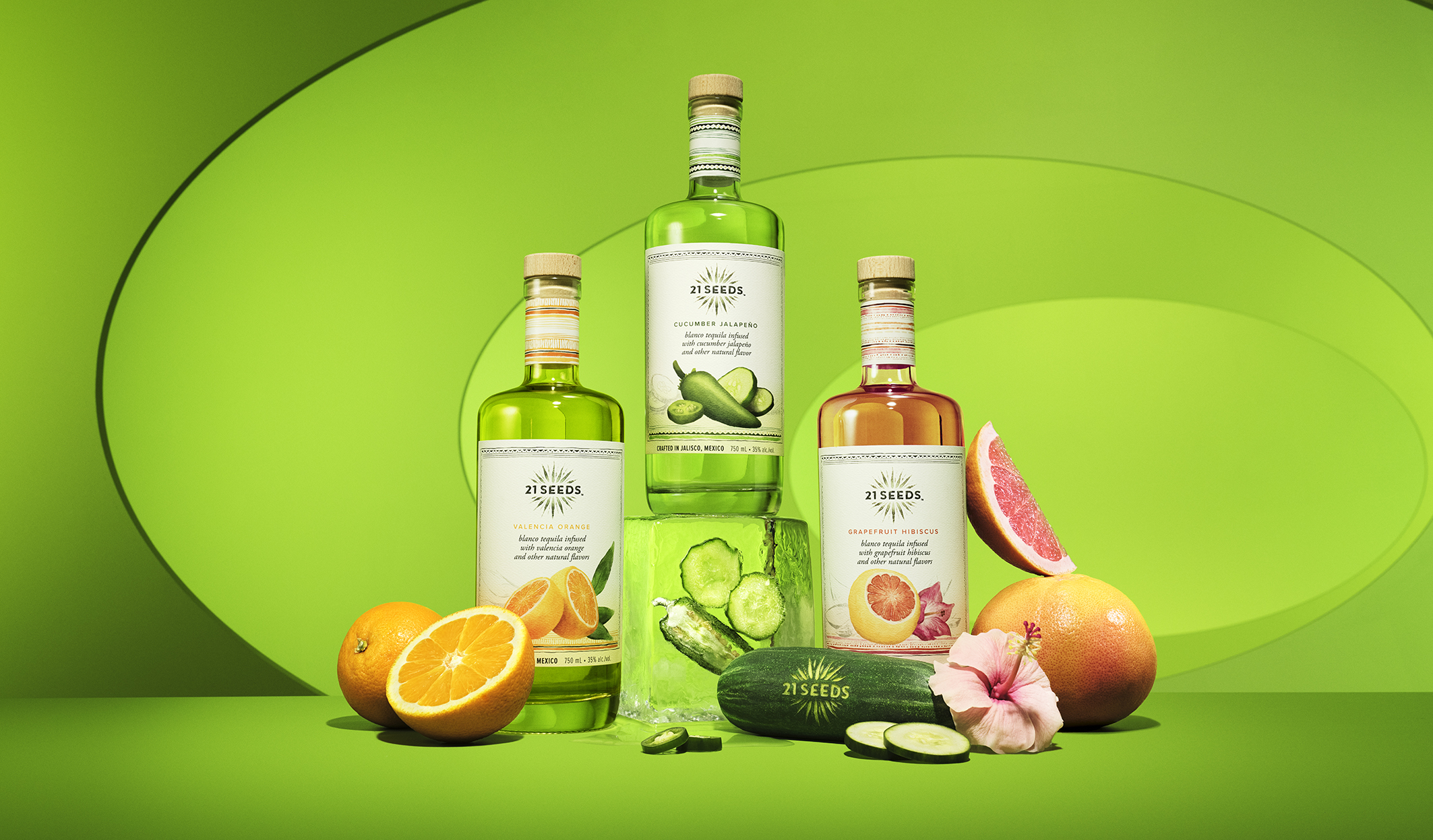
21Seeds is a tequila infused with real fruit. It’s bright, fresh, and made without artificial flavors.
“Flavor, For Real” became the foundation for the creative direction. Not just how it tastes, but how it shows up visually.
We brought that to life through the textures, colors, and energy of real ingredients, creating a visual language that feels bold and tactile.
“Flavor, For Real” became the foundation for the creative direction. Not just how it tastes, but how it shows up visually.
We brought that to life through the textures, colors, and energy of real ingredients, creating a visual language that feels bold and tactile.